
Habituation
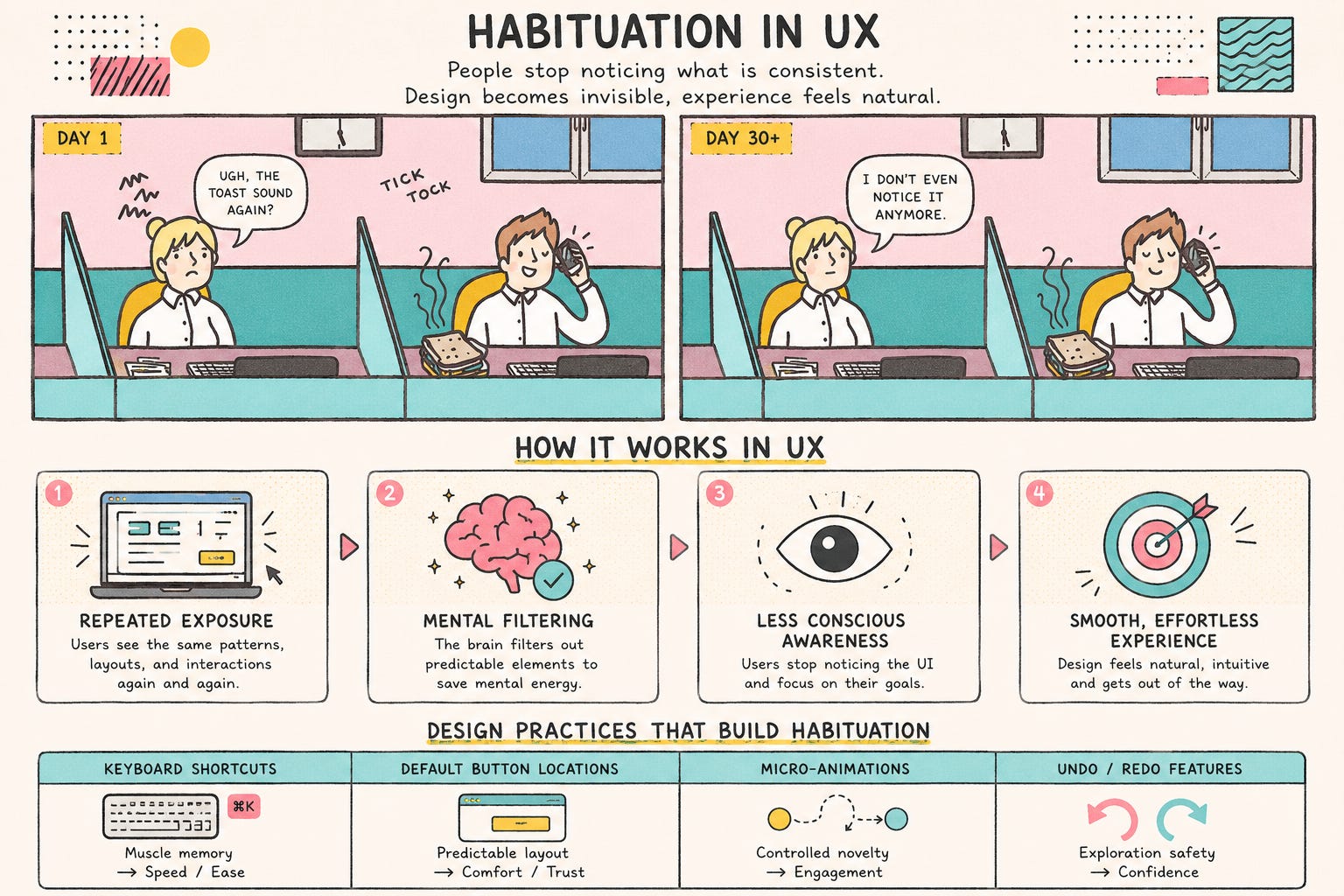
The neuroscience behind why that same banner gets ignored after a week – it’s called habituation, and it’s not because your users got bored.
The Brain Stops Looking After The Second Look
In 2015, a team led by Bonnie Brinton Anderson at Brigham Young University placed people in an fMRI scanner and showed them a security warning, the kind that pop up when software wants extra permissions over and over. Activity in the brain’s visual processing centers dropped dramatically after just the second exposure, and continued to decline with each subsequent repetition. No one decided to stop paying attention. Their brain had made that call before any conscious thought had come into play.
A Word Borrowed from Frightened Cats
The word “habituation” predates computers. Described by Richard Thompson and William Spencer in 1966 studying reflexes in cats, Thompson later teamed up with Paul Groves in 1970 to argue habituation is one of two competing systems, the other being sensitisation, where repetition makes a response stronger, not weaker. There is a soft, steady tapping. Another shock makes you more on edge Which wins depends on the stimulus, and that difference is more important to interface design than most write-ups admit.
Why your banner was dead from the moment you shipped it
The phrase product-world banner blindness comes from a study done by Jan Panero Benway and David Lane in 1998. Those participants who were hunting for a specific piece of information on a page found it via an ordinary link 94% of the time. They found the same information only 58% of the time when it was presented in a bright, banner-style graphic, even though the banner was louder and harder to miss on paper. Years of ad-like content had already trained users to avoid anything that looked like an ad.
The Honest Bit
The other half of the Groves and Thompson theory is left out of most write-ups. Habituation is stimulus-specific: if you tune out a user on one banner, they will immediately notice a different one, because their brain isn’t building a general “ignore this app” rule, but one narrow rule about one narrow stimulus, which is also reversible. In a 2009 update, Rankin and her colleagues confirmed this: If you’re away from a stimulus long enough, the response comes back, a phenomenon called spontaneous recovery. You don’t have to re-invent your entire UI to fight habituation, you just need to know which specific element has gone numb and if enough time has passed for a break to make a difference.
When This Stops Being Annoying And Starts Being Dangerous
It is estimated that 85 to 99% of hospital monitor alarms do not need any clinical action – loose sensors, thresholds set too tight. Same mechanism as the fMRI study, but with worse stakes. Clinicians exposed to that volume stop reacting to the sound itself. A Boston Globe investigation of cases from 2005 through mid-2010 found at least 216 patient deaths tied to alarms that were ignored, silenced or overridden. No one in that chain was sloppy, and their auditory systems did just what auditory systems do when asked to respond to the same signal thousands of times a week. Your dashboard pinging you 5 times a day is not in that league, but the math behind it doesn’t change.
The Cookie Banner Knows What It Is Doing
Some interfaces use habituation on purpose. Rainer Böhme and Stefan Köpsell did an experiment in 2010. They tested versions of a consent dialog on 80,000 users of a privacy tool. What they found out was that people got used to clicking through messages that looked like an agreement. The more a message looked like one of those agreements the more people would accept it without reading it. This is not a mistake in cookie banners. For companies this is what they are trying to do. There is a difference, between something that is not important so it can be ignored and something that is made to be boring so people will just click through it. The people who make these things know what they are doing even if the users do not.
How to Keep Something Feeling New
The team at BYU tried something to make things more interesting. They made a warning that changes every time you see it. It changes shape, color and where the icon is.. The meaning stays the same. They did a study. Found out that people kept paying attention to this kind of warning even after three weeks. The regular warning did not do well. The team did not need to change what the warning said. They just changed how it looked.
Apple does something like this with their iPhone system. They only let apps ask you to rate them three times a year. This way you do not get used to the question. Ignore it. Duolingo does the thing with their reminders. They change the words they use so you do not get bored, with the message every day.
You do not need to change everything all the time. Just pick the things that need your attention like a security warning or a deadline. Change those things up a bit. Everything else can just fade into the background. That is what it is supposed to do
Where in your product is something quietly going numb that you haven’t noticed yet? Comments are open.
And if your onboarding flow still fires the same tooltip on day 47 that it did on day 1, send this to whoever owns it.